

Assignment #1: A Pair of Shoes. Design a composition with a pair of flat shoes. Use any kind of sneakers, walking shoes, old worn shoes, boat or tennis shoes. Keep in mind that the laces provide a nice design element. Play with the composition until it presents something visually interesting that works. Working from a photograph and direct observation, paint the composition, keeping in mind color and value. -- from Braldt Bralds
The Process: I chose to paint my pair of Japanese geta, a kind of sandal with an elevated wooden base and fabric thong. I only wear them in my studio because the flip-flop sound they make when walking drives my husband crazy. I placed them on a small Japanese obi. After photographing several compositions, I settled on this one for I liked the angle of the shoes and the soft folds of the obi. I made both a color print and black & white print of the composition, the latter to help focus my eye on the relative color values – the darks and lights. As I began the painting process, I quickly realized the challenges presented by my choice of shoes: I had to represent the solid wood base of the shoes and the soft fabric of the thong and obi. Using Saral, a wax free transfer paper, I transferred the image to watercolor paper. With a hard HB pencil, I added the details of the wood grain in the platform of the shoes and also added shading using graphite. I then applied a fixative over the pencil sketch to preserve the details and prevent smudging. I was now ready to apply watercolor washes while first preserving the whitest white areas like the highlighted edges of the obi. I could have applied Frisket to mask the white areas, but chose not to, knowing that if necessary, I could add the whites later using gouache. To achieve the shiny, wood grain surface of the base of the shoes, I added Gum Arabic to the paint; the medium adds gloss and brilliance to the painted surface. After much experimentation and several failed attempts, here is the final painting.
The critique: Artists are often too hard on themselves and I’m my toughest critic. In spite of much experimentation and several failed attempts, I was disappointed in the final painting. First, there was not enough color contrast. Rather than staying true to the colors of the obi and thong, I should have taken artistic license and used a cool color -- perhaps on the thong or obi -- to contrast with the overall warm reds. The piece also fails because all the color values fall in the mid range. I welcome your comments.
Lesson learned: Tonal values are critical. The lights and darks contribute more to the success of a painting's composition than any other factor, including color. Begin each painting by locating the darkest darks and lightest lights.
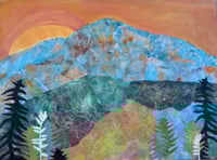
Sunrise Over the Sangres, mixed media on canvas, 30 x 40
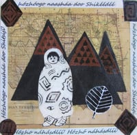
Walking in Beauty, mixed media, 8x8. In permanent collection of the Museum of Collage and Assemblage.See more this series on the Native Abstractions page.
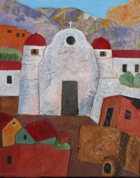
Mission Church, mixed media on canvas, 20 x 16. See others on my NEW Mixed Media page.
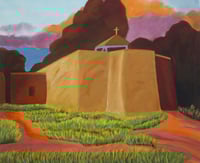
Mission Church, oil on canvas, 24 x 20. See more of these works on Latest Works page.
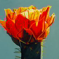
Firecracker Cactus
Acrylic on canvas,
10 x 10, See more on the Small Works page.

Pastiche I, collage, 12x12 image size, 16x16 matted. See more on my Pure Abstractions page.
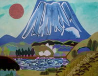
Flower Moon 雪国
Collage, watercolor,
20 x 16, matted. See more Japanese-inspired works on my Asian Abstractions page.

San Geronimo Runners,
36 x 12. See more on Native Abstractions page.
Write a comment