

Chiaroscuro is an Italian word literally meaning “light vs. dark” and is used to describe the skillful balance of light and dark in a painting with strong contrasts to create dramatic effects.
Assignment #2: Anything that hangs on a coat hanger: Choose a piece of clothing or a draping cloth to hang on a hanger. The item could be a shirt, coat, jacket, pajama top, dress, shawl, robe – whatever you choose. Drape the item so that interesting effects are produced by the light and shadowed areas. Use your subject’s true color as your “medium” color and define the lighter and darker parts of the composition. -- from Braldt Bralds
The Process: I chose to paint my robe from the Japanese spa, 10,000 Waves. I love this robe for its comfort and because of the bold graphic design – the Japanese characters on the back of the robe. I photographed the robe hanging in full sunlight to capture the lights and shadows of the robe’s soft folds. I transferred the image to watercolor paper and filled in some of the dark shadows using graphite. I could now begin the painting process. The overall true color of the robe is a light buff but what became immediately clear is that there is a clear range of dark and light values – a value of 1 being the lightest and 7, the darkest. Because the light source came from the left, the shadows were cast on the right. The challenge was to capture the transition and range of color values across the garment. After isolating the whitest whites along the left-most edges of the folds, I applied a watered-down mixture of Burnt Sienna and Cobalt blue for the shadows. My intent was to leave the white of the paper as the whitest, #1 value. After the first wash was dry, I then applied another wash of the same mix of colors to put in the low-to-mid-range of values, the #2-4. Once dried, I applied another layer of the color wash to the darker shadows, the #5-6 and finally added the darkest, #7 value to the dark folds. What about the background? I chose a monochromatic background – a light wash of Burnt Sienna -- with additional washes to capture the shadows cast by the robe. In the process, some of the whitest whites were lost so I adjusted them by added gouache to the mixture.
The Critique: While I succeeded in capturing a range of values -- #1-7 –there is not a smooth transition of color across the folds. This could have been achieved by using a wet brush – with water only – to soften the hard edges of the shadows and folds. The beauty of watercolor is that it’s not too late. I can easily go back in with a wet brush to soften the shadows and values. While I wanted a monochromatic look, the overall painting might have been enhanced if I had chosen a warmer background color to offset the cool shades of blue and grey in the robe.
Lesson Learned: Determining value helps in choosing a color palette, making color mixtures and placing objects within a composition. Value creates mood, contrast provides drama.

Sunrise Over the Sangres, mixed media on canvas, 30 x 40
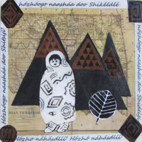
Walking in Beauty, mixed media, 8x8. In permanent collection of the Museum of Collage and Assemblage.See more of this series on the Native Abstractions page.
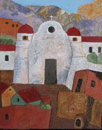
Mission Church, mixed media on canvas, 20 x 16. See others on my NEW Mixed Media page.

Mission Church, oil on canvas, 24 x 20. See more of these works on Latest Works page.

Firecracker Cactus
Acrylic on canvas,
10 x 10, See more on the Small Works page.
Pastiche I, collage, 12x12 image size, 16x16 matted. See more on my Pure Abstractions page.

Flower Moon 雪国
Collage, watercolor,
20 x 16, matted. See more Japanese-inspired works on my Asian Abstractions page.

San Geronimo Runners,
36 x 12. See more on Native Abstractions page.
Write a comment